Sportlyzer launches new design, prepares for the future

Sportlyzer is delighted to announce the launch of our new web layout. Based on customer feedback and our mantra of continuous progress, we have come out with a new sleek design in our web application to bring you a simpler, more comfortable and enjoyable way to use Sportlyzer. It’s as pretty as spring sunshine and will be a huge step towards realizing our vision of a software ecosystem for developing sustainable, well-functioning sports clubs.
Firstly, let’s appreciate our design team and Stefan Hiienurm from Thorgate here, because we are really proud of how the whole new layout looks like. The end result is great. It’s probably like watching your team execute that play from the training ground to a perfection in the game. Just beautiful to watch.

It’s also a great leap for the future of Sportlyzer. Let’s compare it to building a rocket to fly to the Moon. There are so many bits and pieces that all have to work together. Some are bigger, some are smaller. Some are necessary for the launch, others for the precision in space. Sportlyzer’s new web layout is like the rocket booster of a space ship – a way to escape Earth’s gravity to reach greater heights. It’s a launch in every sense of the word. Like a fertile soil for our ecosystem to grow in.
This fertile soil is also the ground for sports club to flourish in. As we add more and more apps, we strive to offer a complete package for the coaches and club managers to bring out the best results – sustainable and growing clubs with healthy, happy and well-performing athletes.

So are there any changes for users?
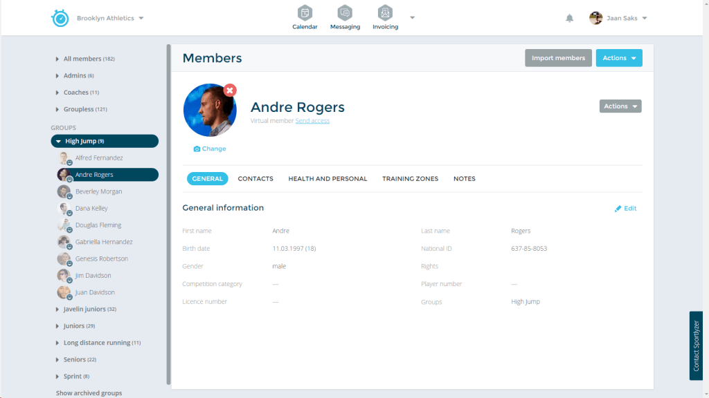
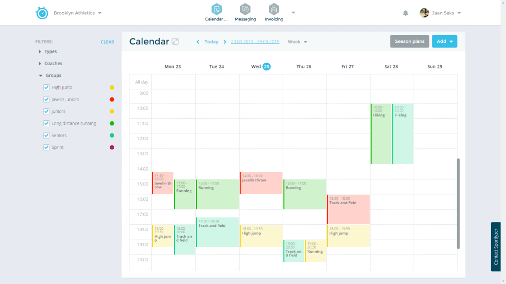
As you can see at first, we have changed the color scheme of our web application to give the platform a nicer and sleeker look. For everyday users, however, there are only a few changes to get used to.
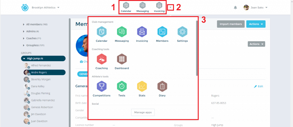
In our new design, we have moved the menu for navigating between our different apps to the top of the page. This will give our users a better overview of our apps and a quicker user experience.
To navigate between apps, just go to the top of your page and click on the down arrow.

Furthermore, we have increased the area in which our apps are displayed in. This should give the whole system more functionality, making it easier to work with.
We’re sure you will enjoy our new design so go check it out yourself! We’ll keep you posted for other updates coming out soon!
