Sportlyzer launched new workout view that makes you train smarter
Sportlyzer released new design which, in addition to improved usability, teaches users to see the specifics of their workouts, and therefore learn how to train smarter.
Former graph has replaced by detailed workouts and daily training suggestions
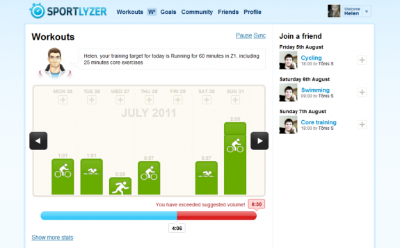
New workout view supports specific training suggestions for each day. Suggested trainings appear in the graph, detailed description for the training in visible in the box above the graph (see the picture below). You can choose whether you’d like follow the suggestion and/or do another training. In case you decide to do something else your plan for the rest of the week will be recalculated.
- New workout view
Bar for weekly training load
For better understanding we’ve decided to split heart rate zones and weekly training load (done/suggested). In the general view you can now see your total weekly training load without heart rate zones. In case of exceeding your suggested weekly training load, the right side of the bar turns red as visible on the picture above.
Heart rate zones and your ideal weekly balance
Your suggested heart rate zone balance in comparison with your current weekly balance is now given below the graph if you click on “more stats”. Placement into two pie charts (see the photo below) gives better understanding of the heart rate zones balance and also an opportunity to compare and try to match your trainings with the suggested balance.
Data export
And last but not least – it is finally possible to export your workout data as .csv! Simply click on “export to CSV” below the graph and select dates in the calendar.
We hope you enjoy the new workout view. Click here to try it out now!


